back

membership card
Introducing a method membership card to the enable customers to try before buying body care products to make them satisfied with their choice of purchase of their favourite fragrance.
role
UX/UI design
team
Research : Jesha Shah, Akshay Kenjale,
Anushka Khurana, Avitha Celestine,
Innovation : Jesha Shah
time
12 weeks

*The following project represents a hypothetical academic exercise. It does not reflect work endorsed by the representative brand.
research
To better understand the brand background and their users while observing all their stages from discovering, investigating, purchasing, unboxing , use & experience to retention.
Research methodologies :

user interviews
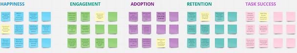
Using HEART model, we brainstormed on the interview guide and user survey.
Starting with what made the user pick up the product and not its competitors instore, user’s purchase journey online and offline - the pain points and the gain points, behaviour and process of product use, and their level of satisfaction with the use and the appearance of the product.
brainstorm

.png)

.png)

Brainstormed and mapping all the data of each users and grouped them by common themes which we used to extracting the Method’s strength, weakness, opportunities and threats. It also highlighted the common pain points faced by the users.

SWOT analysis
Method's strength lies in their aesthetics and minimalism. They have missed out on important information like fragrance description and promoting hygiene.

user persona
Using what we learnt from the research and analysis, we created a user persona that represents who we are designing for. It guided us through the design process and shed light on the user goal, need and challenges.
Meet Jack:

journey map

discover
investigate
unboxing
use
purchase
retention
Jack went to the store to buy a method handwash, stood at the aisle for a while, thinking about which scent to buy. He finally decided to go for Method gel hand wash, violet + lavender. Exhausted, he then decides to call it a day and make the remaining bulky cleaning supplies online instead.
Back at home, his friend noticed his new Method hand wash and asked about it. So, Jack decides to buy her a new fragrance of Method online as a gift and goes for Poppy Field, despite being reluctant about the scent.
Innovation
After journey mapping, I chose to work on the touchpoint purchase. Identifying the pain points of the users during the online and instore experience of buying the product, the project was then taken forward by me individually.
problem

ideation
I used accelerator cards for brainstorming and ideation. Cards consisted of existing business models of the different brands. We had a time frame in which we had to come up with different ideas around it.
Final idea
Membership card for method which enables users to try any 3-sample tester on each purchase. Also engaging them with yearly subscription with discounts and auto ordering.
story board
Dozens of choices of products and fragrances always make us confused what to buy. Especially when it comes to body and health care, it is important to make a right choice.
how might we
How might we enable users to identify fragrances to make them feel satisfied with their choice of purchase.


moscow analysis
I used kano cards to analyse on all the brainstormed features and divided those in must have, should have, could have and won't have which helped me to take it further.


user flow
Now that I knew what all features to include in my innovation, I created a user flow to understand different scenarios according to user goals.

lofi wireframes
Including all the features and steps, I started developing on low fidelity wireframes sketched to understand the screen layouts and elements in each screen. I worked on the screens in order to enable users to complete their tasks and reach end goals.


mood boards
We started with the visual design with an activity of pulling out words from different images associated with the brand and my feature. After selecting 5 words, I made 5 different mood boards with those words.
.jpg)
.jpg)


I went forward with the word "eco - friendly" as method promotes sustainability through their different campaigns and their products. Also, the current colorful method logo and website have green touch missing.
UI style guide

high fid wireframes


First time users visiting the website who are not the member of method. It will advertise about the membership and ask to register for it.


Returning members to the website will see the promotion to get free samples.
As the user click on add to cart, they are prompt with a pop up of recommended samples. They can click on view more to see more options for samples. They go through the checkout process further.


Users are asked the feedback of their previous sample orders.
One click allows the user to order the product for the next time.
It allows easy and quick ordering without any payment information required.


